Old-school UX says that a landing page button should look like a button, meaning it should look like it can be pressed (3d). And that may hold true for the boomer generation, but if you are catering to a younger demographic with your landing page, it’s becoming less and less needed. As a culture, we are becoming accustomed to everything being pressed, dragged, or manipulated in some way or another, and we are less reliant on that 3-d requirement of 10 years ago. We’ve adapted to the changing technology.
With that said, always take your persona, customer avatar, and/or demographic into account and understand there are different visual requirements for every group of people.
Well, it’s now 2020, and users’ expectations have grown and shifted. 3-D buttons may be on their way out, but there are always new and fun requirements that show up as we become desensitized to the advertising around us.
That’s why I bring you, 10 Reasons Your Landing Page Buttons Are Killing Conversion!
#1 – They are pretty.
Designers love making things “pretty,” even at the cost of functionality, clarity, and legal requirements. And <cough> <cough> I was guilty of this for years, because, pretty sells, or so I thought.
Here is the most important thing you will read in this article.
Your designs might be beautiful, BUT if they don’t take into account the user, what they need, what they like, and what drives them to buy, they will fall flat. You aren’t designing for you or your client, you are designing for the customer even if you’re forced to create the ugliest landing page buttons of all time, that make you want to vomit (been there!), you still do it, because your personal style has no bearing on the product you produce if you care about conversion.
#2 – You’re using Black Landing Page Buttons
Or some other color that doesn’t pop-off the page. Users are conditioned to disregard buttons, to skim over them quickly because they are continually being bombarded with calls to action, EVERYWHERE!
You know what is easily skimmed because it blends in with a page (except in infrequent circumstances), BLACK BUTTONS.
Think Contrast.
Draw the eye to the CTA, and don’t let them blend in.
Choose the brightest color from the brand or a color that could work with the branding that will stand out!
Whatever color you decide on for the landing page buttons, minimize the use of that color throughout the page. For instance, you have this amazing bright pink color, and the other colors of the brand are more neutral, so you obviously choose to use the bright pink for the buttons, BUT you also use that same pink within the images, backgrounds, typography, etc. so no matter how BRIGHT that color is, it gets completely lost on the page.
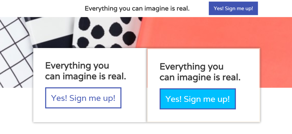
Here is an example of two styles of buttons.
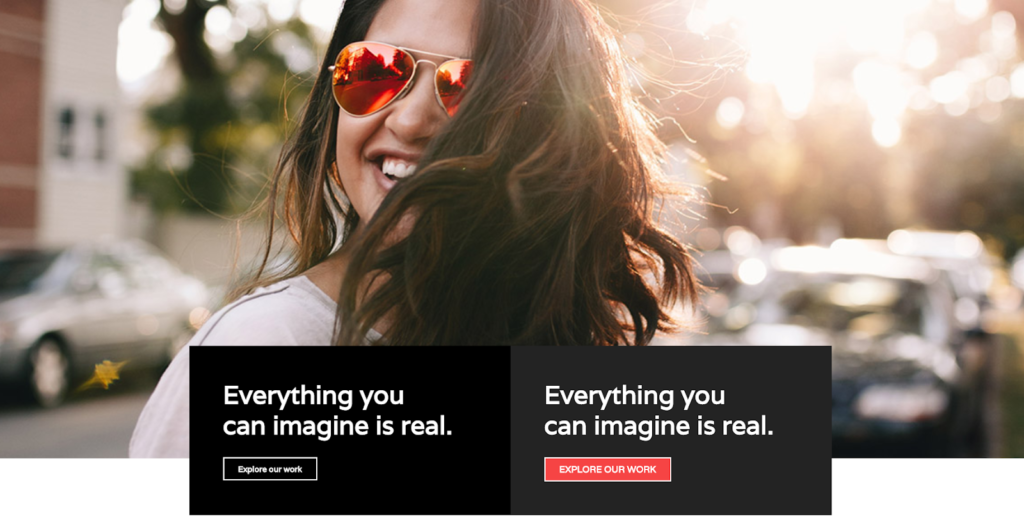
Which button do you see? It’s the red one correct? The white bordered button is totally lost on the screen because it blends in with the white type (also the text is too small but I’ll address this later).
Because you move from left to right you first see the sunglasses first but your eyes then connect that color accent with the button on the bottom right. The ideal landing page button placement will always be in the button right-hand corner because of the direction that we read and where our eyes are drawn to on a page. Use contrasting colors to show a user where their eyes should move, but don’t oversaturate your design with the color you use for your buttons.
Use it strategically.
#3 – Your buttons are itty bitty
Not to be cliche, but Bigger IS Better in regards to button size.
You want a big’ol button, not a stylistic cute one. Shocking as it is, you need the user to be able to find the place to click, so don’t let those things hide among the text. MAKE THOSE LANDING PAGE BUTTONS BIG AND BOLD!
I see this problem on soooo many websites; people are like hey click here → , And they are merely using a stylized link or an itsy bitsy button that is lost in the abyss of the copy. Don’t do that.
The bigger, the better. ????
#4 – The Button Color Scares them away
So this is where you throw out the “Brighter is better” philosophy when you need to. Sometimes a neon green button is a deterrent. Shocking, I know. Let’s talk about an example where it isn’t appropriate.
A website geared at being SOOTHING so that a meditation site would be a big no-no. So what do you do?
High contrast but not neon. It’s still important to keep in mind high contrast. You can do this by keeping the color of your landing page button out of any other place on the page. You have neutral colors, tans, pale greens, etc.…. Pick the brightest from the bunch, and just don’t use it anywhere else. Here is an example.
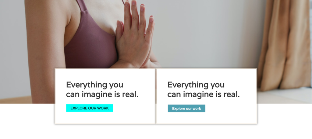
Your eyes definitely see the bright turquoise button on the left, BUT is it appropriate, probably not. If the branding is very neutral and relaxed, you will want to maintain that feeling on the page. A neon button will cause a more aggressive feeling in the body and someone who is looking for “relaxation” would quickly bounce off the page.
Now instead you choose the most contrasting color in the branding and use that as the button color. Then use the other colors, or complimentary colors to the other shades in the branding in the imagery and headers instead. The eye still sees the buttons, but it doesn’t feel overwhelming.
#5 – Your button CTA is unclear
Don’t be vague, tell them what to do, what they should feel – “Yes, sign me up!”, “I’m ready!” Anything that gives them the apparent place to click.
#6 – The Button Typography is illegible
The new trend is script fonts, and boy do my eyes LOVE IT. BUT, it should be used sparingly, it should always be readable BY ANYONE and NEVER UNDER AND CIRCUMSTANCES use it on a landing page button. Just no. (PS custom fonts slow down your site!)
Which is easier to read? Obviously the right, and you NEED users to be able to read the buttons.
#7 – Your never tested your landing page button color
It’s incredible how much button color matters! But sometimes what you think will work, don’t always. That’s why you should A/B test your button colors utilizing something like pretty links or crazy egg to help you find the right color for the audience. Which may turn out to be (gasp!) a black button. Your customer has spoken, and at the end of the day, the goal is sales, not always abiding by the rules.
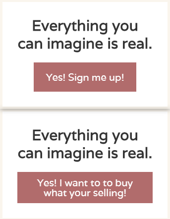
#8 – Your CTA on your button is too long – causing it to stop looking like a button
Most of us are conditioned to think anything found in a rectangular box is a button, so this isn’t true for every user. But in my experience, buttons are often missed when the CTA becomes too long. The text above the button should explain what the user should do, while the button itself should be very direct and to the point. That way you avoid people “missing” the button because they don’t even realize it’s a button. (This is especially true on mobile devices like below)
#9 – ADA Button Compliance
Some of you may be outside the United States BUT if your country has guidelines for accessibility then you better apply those to your buttons! (Also it’s just good to make them accessible even if it’s not a law in your country).
What does that mean? Make the type BIG and with a high CONTRAST, so your user can read the type, no matter how bad their eyesight is.
Size 16px is the minimum as of 2020 in the US and although there is some gray area for contrast, you should still run it through the ADA compliance software to get a good idea whether you are compliant.
Here is the program I use. Now keep in mind, it almost never approves the contrast with white text but at least it gives you a good idea on whether you should dive deeper into the contrast rules.
#10 – Your fixed header CTA button is the same as the rest of the buttons on the page.
We all love the fixed header landing page buttons that scroll with the page so the user can always access the button when they have decided to purchase. This is a great feature to any landing page, BUT it can feel a little oversaturated when every button the page and the header all look the same. (And for the most part, all of your buttons should always be the same color when it’s appropriate).
My advice here is to utilize a complementary color or use an outline of the button color instead. That way, it a tad bit different, so it doesn’t seem overwhelming with too many buttons on the page but it still psychologically connects the CTA to that color on the page.
My last piece of advice. As long as you are testing, get ready to throw out nearly every piece of advice on this page. Every audience is different and you may find that your user likes black buttons for some strange reason. Well then give them black buttons! You are designing for the user, not your client, and not for yourself. Give the user what they need to convert them into a sale so that you can achieve landing page rockstar status!